Blogging, while centered upon writing, isn’t wholly composed of just that. It also has a lot to do with how your site looks, the way it is laid out, and its general appeal. More often than not, readers can be turned off by a site because of the clutter covering the page. Allowing this to go on will surely make you lose a lot of readers, and will result in less interest and buzz. On the internet, this isn’t something you can allow because in order to stay relevant, you have to have a ton of followers at your back. So what do you do when your site needs a bit of sprucing up? Well, why not try a different format like free magazine templates that are sure to upgrade your blog.
10. Mash 2
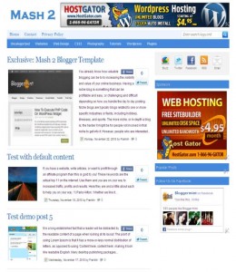
If you’re looking to upgrade your site a bit, but you don’t want to go for heavy overhauls, then Mash 2 is a great place to start off. Firstly, the magazine template is laid out like other more standardized sites. This gives it that old school appeal, as all the options and buttons are just located at the top bar of the site. It contains most categories that you’d insert on the page, and content is, as usual, assigned on each page. While this template has some very conservative flavor, it’s worth a look for those that don’t want too much flash.
9. Simplex Focus 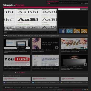
Following up a conservative option, this template is well named because it is simple. It has a very cubed layout and reserves spaces for advertising. The look isn’t too intrusive though, as each ad is nestled between the grids of cubes. Each cube within the grid contains the content that fills your site, and there are around six small cubes, with a large feature located right above them.
8. Medusa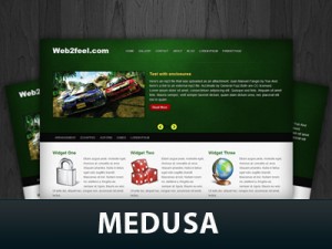
Do you like your content in featured spots right from the get go? If so, Medusa just might answer that need because of its overall intuitive opening page. As you load it up, the options bar stays prominently in sight, offering the usual buttons like home or archive. The key feature that really lets users know about your blog content is the constantly sliding features right at the bottom of the menu bar. The fonts are a little basic though, and the design might a little clunky, but overall, Medusa can really catch attention from your users.
7. Irresistible blue, pink and other colors
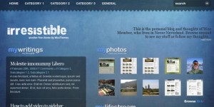
This template is a bit more unique than the first three. From the first page you see, one might think that this is one of those conservative pages, but at the same time, the layout is not traditional. The picture gallery is located directly to the right part of the screen as a reader loads up the page. On the left, a small space is reserved for the feature content, followed along by the rest of your work. It has a pretty cool look and approach to the design for the magazine, but it can also be a little confusing as everything is laid bear on the first page.
6. Upside
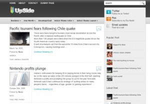
Looking for a straight forward design with a no nonsense look? Well, if you are, you might want to check out Mash, however, if you want a bit more color to you stuff, then Upside is another great option. It has the same elements that most of the other templates on this list have, but it presents it in a long page form with features being located in succession of each other.
5. WoodMag
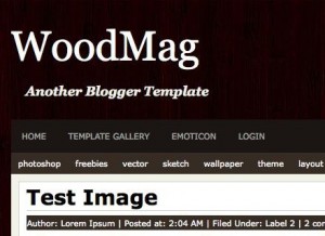
While this isn’t the best look for a web magazine, it still employs a great aesthetic. It’s more functional than most of the other pages in this list as it throws back to older looking blogs and pages. The buttons are laid out well enough so that they catch the eye, but the features are all located a little to the left of the page in descending order. The wood design behind the page is also a nice little touch because there are enough metal themes online. Overall though, this page seems to be more for the photo blogger than the writer.
4. Driftwood
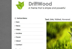
This template is a little more similar to WoodMag, as it is laid out in a similar fashion. The key difference is that the edges on each feature are rounded, and that comes off as more appealing. It’s also got a pretty good layout when it comes to the buttons. You see, instead of being all on top, the more integral buttons like contact info and your profile are all placed at the right of the page. The archives being stored at the bottom will also be beneficial because it doesn’t intrude on the main design.
3. Dreamy
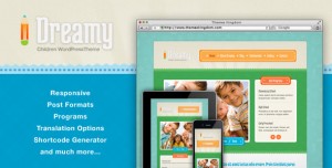
If you’re up for a little more whimsy laid out in light blue, then Dreamy is the template that is perfect for your blog. The theme itself seems to revolve around RSS feeds though, but that only serves to make interactions between you and your readers much easier. Overall, the page has some good looks, and while there are only three default tabs, it can be modified to have a little more for those that have an expansive amount of media.
2. Zexee
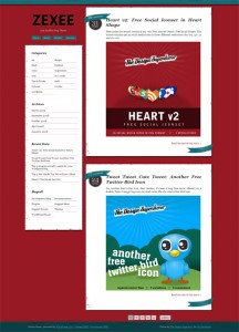
Zexee is a very unique template for people that want a unique look to their blogs. The page makes each post in your content cool looking, as they are framed in their own individual box on the left side of the screen. It’s also got a flashy aesthetic to the titles, and it looks great that way. All your important info is laid out on the right side of the screen, in a little separated space.
1. Old Paper
When it comes to some of the most appealing looks, sometimes the retro approach is best. This seems to be the idea behind Old Paper because of the old newspaper feel of the template. The page and the way they display content is very elegant, being that they each have their own borders that separate the featured content. At the same time, the whole thing is backed by wallpaper that resembles very old paper. The feel of the template is great, so go ahead and check out the Demo.
Leave a Reply